G’day, so I’ve made this write-up of the pros and cons of the various logo designs, and I’ve tried to be objective but to be honest I definitely have a favourite that I want to campaign for.

#1 – Dancer
Pros: emphasises dancing / movement, cool looking design
Cons: not all of our tunes are about dancing…

#2 – Human Flame
Pros: human sparking creativity, flame element, suggestion of “F”
Cons: maybe could look like the person is ON fire, instead of summoning fire…

#3 – Line Flame
Pros: super simple, easy to draw, looks like a flame and suggestion of “F” and stick figure with their arms up
Cons: Just looks like a candle, easily associated with other things eg. religion

#4 – Note
Pros: music note with wings, two F’s in design
Cons: lacks “human” element and other music / band concepts like unity, community, collaboration, etc

#5 – Flamy
Pros: cute human flame character
Cons: bit of a “mascot” vibe, doesn’t connect much to story and vibe of the band & music in my opinion (eg. unity, community, collaboration, etc)
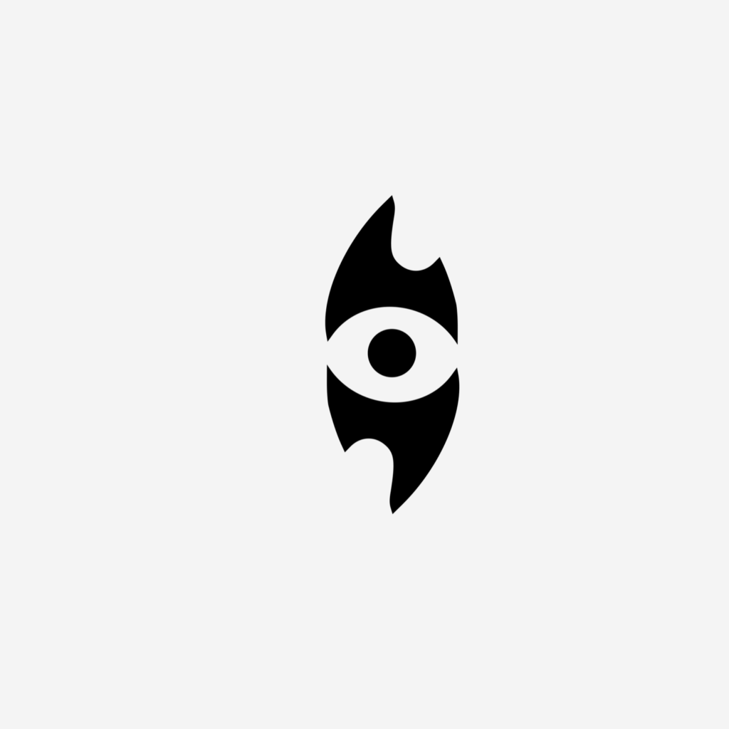
#6 – Eye
Pros: two human figures form eye and flame, also suggestion of rockstar heavy eye makeup (could be used as actual makeup design), “dancing” in a circle & collaboration vibe, suggestion of “Fs”, flame shapes suggest Australia, “eye” image is strong and easy to animate, also this image uses elements of CC & D.A.’s designs together, all other logo images were one or the other of us.
Cons: maybe it’s too “strong”? If it’s not obvious, this one is my favourite, and it’s hard to be objective.